Metrics Are The Map, Not The Territory
We can never obtain a complete and perfect understanding of what our systems are doing. All we have are incomplete signals to inform our theories.
NOTE: Check out the other posts from the Concurrency War Stories series here.
Years ago, I was on call, and I got an alert that HTTP 503s had spiked in a service my team owned. I looked at the HTTP status graph and confirmed that 503s were up.
After a few minutes, the spike ended and our system returned to normal.
I wanted to understand what happened, so I started looking for the cause of the 503s. A pretty common cause was when our system hit its configured limit of concurrent requests, which was set to 100.
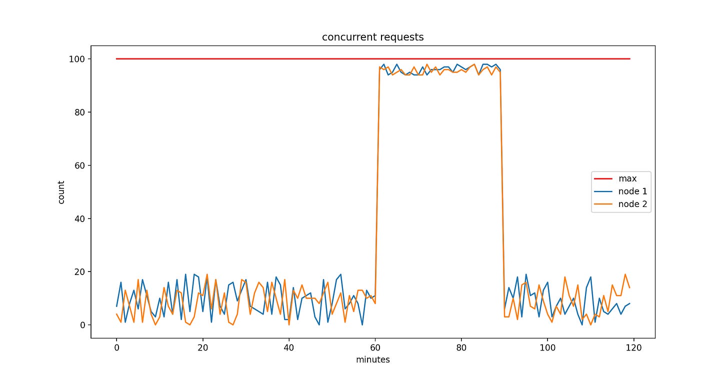
I looked at the graph for concurrent requests and saw this:
The red line at the top indicates our configured concurrent request limit (it would probably be clearer if it was dotted, but I can’t find the code I used to generate it - apologies).
I couldn’t find any other possible cause for the 503s. I examined our access and error logs on a few nodes and confirmed that:
They were definitely hitting the concurrent request limit
The counts of concurrent request errors matched the number of 503s returned on these nodes.
This was good - I now knew what happened. I still didn’t know why it happened, but that’s a topic for another post. But here’s what I still couldn’t understand: if we only return 503s when we hit our concurrent request limit of 100, why doesn’t the graph ever show the value getting to 100?
Let’s take a step back and talk about how this graph came into existence:
We had a cluster of 200 servers, each of which stored the current number of concurrent requests as an AtomicLong in memory
We had a metrics aggregation system that fetched the concurrent request metric (along with many others) from each server, once per minute.
We had a metrics UI that presented the number of concurrent requests as a graph
The metrics UI computed the average value across all nodes in the cluster by default. You can see here that I’ve instead split the graph by node, which ensured that I was looking at the specific sampled values per node and not a cross-cluster aggregate.
So why don’t we see the value getting to 100 on each node?
Because it only happened in between the sampling periods.
A sample happens at a unique instant in time, similar to how long your vision goes dark when you blink your eyes. You may never find graphical evidence that your system entered into a specific state at a specific instant, so all you can do is construct a highly plausible theory with as much corroborating evidence as you need to feel comfortable.
Metrics are a map, not the territory - a synthetic, imperfect view of your system. If you keep that in mind, you’ll sleep easier at night - assuming you don’t get paged.


